Clear, Black or Tortoiseshell Glasses? A Canadian Guide
Compare clear, black and tortoiseshell glasses with real frame examples, colour checks and a practical style shortlist for Canadian and BC readers.
6 min read · Published October 16, 2026
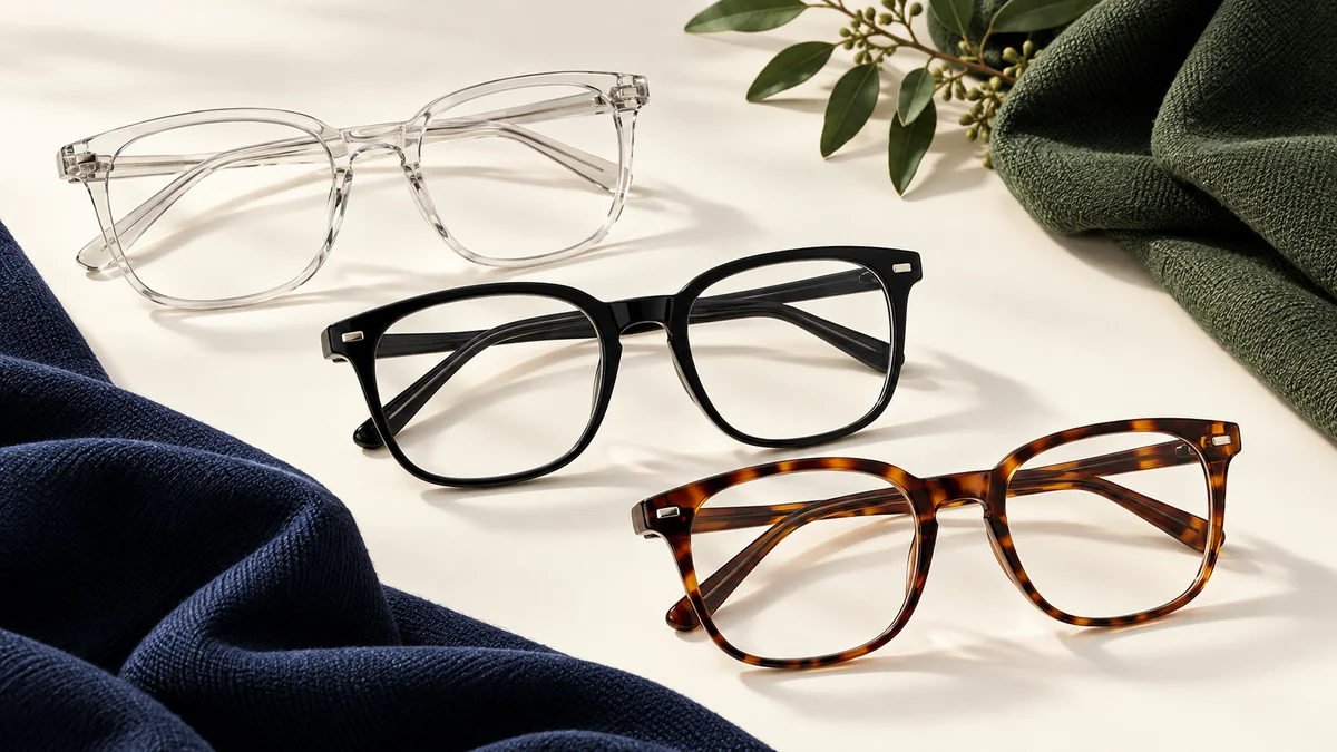
Choose clear glasses frames if you want a less solid-looking outline, black frames if you like a strong visual edge, or tortoiseshell frames if you prefer a pattern that mixes darker and warmer tones. These are style starting points, not rules about who is allowed to wear each colour.
For Canadians choosing glasses online, the most useful comparison keeps the frame shape consistent while changing the colour. Otherwise, you may think you prefer a colour when you actually prefer a different silhouette. Check your frame size and measurements first so that colour is not doing all the work in your decision.
Clear, black or tortoiseshell: the quick comparison
The descriptions below are editorial style observations. Your own preference, the exact frame and the light around you matter more than a label.
| Colour family | A reason to explore it | What to inspect before deciding |
|---|---|---|
| Clear or crystal | You like seeing the frame's shape without a solid dark rim | Tint, transparency, rim thickness and reflections |
| Black | You want the outline to be a visible part of your look | The shape of the upper rim and how bold the whole front appears |
| Tortoiseshell | You enjoy a mix of tones rather than a single flat colour | The size, placement and contrast of the pattern |
There is no universal winner. A black frame may be exactly right for someone who wants a defined outline, while another person may prefer the way a crystal frame lets more of their face remain visible. Both can be deliberate choices.
Why compare colours within the same frame style?
Changing the frame shape and colour at the same time makes a comparison harder to read. A broad black rectangle and a narrow clear oval differ in several ways. If one looks better to you, the colour may explain only part of your reaction.
Start with one style offered in several colours. On the XEYE QM33301, the catalogue labels include BLACK, DEMI, BROWN and TRANSPARENT, checked on 15 October 2026. DEMI is the patterned option to inspect when comparing a tortoiseshell look; use the photographs to judge its particular tones.
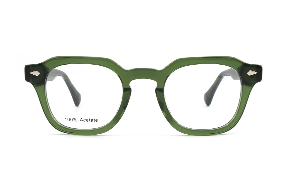
Use the same image angle for each colour where possible. A front view is useful for comparing the outline, while an angled view helps you inspect the temples and the pattern around the corners. Do not compare only the tiny colour swatch if a larger photograph is available.
What to look for in clear glasses frames
Clear is a family of appearances rather than a single exact shade. A frame may look almost colourless, softly tinted or translucent. Read the product's colour name, then inspect the photographs to see what that name means for the specific style.
Look at the bridge and the outer corners first. Those areas can reveal the thickness and tint more clearly than the centre of a lens opening. Then check the temple arms, since a clear front and a differently coloured side can create a different overall look.
If you like the idea of clear frames because they seem discreet, compare both slim and more substantial shapes. Transparency does not make the physical outline disappear. You may find that you enjoy a sculpted clear rim precisely because its shape remains visible.
A useful question is: do I like this frame's shape even before I consider its transparency? If the answer is no, try another shape rather than asking the clear colour to solve the mismatch.
What to look for in black glasses frames
Black makes the frame's outline easy to see in a product photograph. That makes the upper edge, bridge and corners worth close attention. If one of those details is the reason you like the style, black may help make it a deliberate feature of your look.
Compare the whole front rather than the colour name alone. A fine black rim and a broad black rim are different style choices. The same applies to a softly curved corner versus a more angular one.
For another catalogue example, the XEYE RTA2607 includes a black option labelled S.BLACK. Its 55□17-145 size marking differs from the QM33301's 49□24-145, so use the two as examples of different frames rather than a controlled colour comparison.
If black feels too prominent in one style, you do not have to abandon it altogether. Try a different rim profile or shape within a suitable size range. That changes the design question from whether black suits you to which black frame you enjoy wearing.
What to look for in tortoiseshell glasses frames
Tortoiseshell combines areas of colour and contrast. Some versions have a dark overall appearance with small amber details; others have larger, more obvious patches. Look at the actual product images rather than assuming that every tortoiseshell option will look similar.
Notice where the pattern sits. A lighter bridge and dark corners may give you a different impression from a frame with the reverse arrangement. The temples can also carry a more visible pattern than the front, which matters if you like the side view as much as the straight-on view.
Compare the pattern at both normal browsing size and a closer view. A detail that looks dramatic when enlarged may read as a subtle mix from farther away. Neither is better; the useful question is whether you like both impressions.
Match your wardrobe without following strict colour rules
Lay out three outfits you actually wear often. For a BC routine, those might include work clothes, a weekend layer and the coat you reach for on a damp Vancouver or Burnaby morning. Use your own clothes rather than an imagined wardrobe you rarely put on.
Then ask what role you want the glasses to play. Should they repeat a dark detail, introduce a warmer tone or let the clothing carry most of the colour? These questions turn a vague search for flattering frames into a style choice you can explain.
ZEISS's frame-style guide discusses hair, skin, eyes and personal taste as colour considerations. You can use those as prompts without treating seasonal colour categories as requirements. There is no need to reject a frame you like because a chart assigns it to someone else.
How to make a useful online colour shortlist
Work through this comparison before saving a favourite:
- Choose a suitable style and size range. Keep fitting questions separate from colour preferences.
- Compare the same angle. Use front views for the outline and side views for temple details.
- Open the full photograph. Inspect the bridge, finish and pattern instead of judging from a swatch alone.
- Name the effect you prefer. For example: a defined upper edge, a transparent rim or a warmer pattern.
- Record a second choice. This helps you identify whether the deciding feature is colour, shape or both.
Screens and photography are useful comparison tools, but they cannot establish an exact colour match under every light. If a subtle tint or pattern detail will decide your choice, ask for more information about that specific frame. Avoid treating a small on-screen swatch as a physical sample.
Keep the colour decision separate from comfort
A colour can be your favourite while the frame itself is the wrong fit. The Canadian Association of Optometrists' frame-selection outline treats personal preference alongside technical fitting considerations. Keep both parts of that decision on your shortlist.
Material and colour are separate too. Our guide to acetate, metal and TR90 frames explains how to read those product labels. A colour photograph should not be used to guess the frame's composition.
When you explore the frame catalogue, begin with a size you can compare, choose a shape you enjoy and then use the colours to refine the result. Clear, black and tortoiseshell are three useful directions to explore. Your preferred pair does not need to follow a rule beyond liking the design and confirming the fit.
Prepared by GRAEL editorial. We compared the published colour labels, photographs and size examples on 15 October 2026. Style comparisons are editorial suggestions, not findings from a wearer study. The cover is an AI-generated conceptual illustration; the product photograph shows the named frame.
Questions
- Should I choose clear or black glasses frames?
- Compare the same style in both colours where possible. Clear can create a less solid-looking outline, while black makes the outline more prominent. Neither is a universal rule for your face or wardrobe.
- Do all tortoiseshell glasses look alike?
- No. Inspect the actual photographs for the overall tone, pattern size and placement on the bridge, corners and temples.
- Can an on-screen swatch show the exact frame colour?
- A swatch helps you browse, but it is not a physical sample. Check the larger product photographs and ask for more information when a subtle tint or pattern will decide your choice.